
Your product photos look sharp on your desktop, so you upload them big — 2000 pixels wide, sometimes more. Then a shopper opens the page on a phone with a 400-pixel-wide screen, and the browser downloads that same giant file to display it at a fifth of the size. Multiply that by every image on the page.
That's the exact problem behind the "Properly size images" warning in PageSpeed Insights, and it's a leading cause of poor mobile Largest Contentful Paint. Responsive images fix it — but only if you understand how srcset, sizes, and the <picture> element actually decide which file to serve.
This guide walks through all three in plain language, with real numbers, and shows the exact pattern Google indexes cleanly. It's the sizing layer of the broader picture in our complete image SEO guide.
Key Takeaways
- Serving one desktop-sized image to every device is the top cause of "Properly size images" warnings — and images are the largest contributor to overall page weight (Web Almanac 2024).
srcsetlists image sizes;sizestells the browser how much space the image will fill. Withoutsizes, the browser assumes the image fills the full viewport width (100vw) and picks too big.- Google indexes the image in the
srcattribute — the fallback — not thesrcsetvariants, so always pointsrcat a good full-size file (Google Search Central).- Use width descriptors (
400w) for product photos and<picture>only for art direction or format fallbacks (AVIF → WebP → JPEG). For plain resizing,srcsetalone is enough.
The Problem: Phones Downloading Desktop-Sized Images
When you serve a single large image to every device, phones pay for pixels they can't even display. That waste is measurable, and it lands directly on your mobile Core Web Vitals.
Do the math on one image. Say your product photo is 2000 pixels wide, and a phone shows it in a 500-pixel-wide slot. The phone needs a quarter of the width — which is one-sixteenth of the pixel area, because area scales with the square of width. The browser downloads sixteen times more image data than the screen can use.
Bytes don't scale quite as steeply as pixels, but in practice that oversized file is often five to ten times heavier than a properly sized one. Across a product page with a hero, a gallery, and related items, that's megabytes of wasted mobile bandwidth on every visit.
It matters because images are the heaviest thing most stores ship. The Web Almanac's 2024 analysis found images are the largest contributor to overall page weight across the web (Web Almanac 2024). And that weight hits the metric Google watches: on mobile, images are the Largest Contentful Paint element on 73% of pages (Web Almanac 2025).
Responsive images solve this by giving the browser a menu of sizes and letting it pick the right one for the device. Here's how that menu works.
srcset + sizes: How Browsers Actually Pick an Image
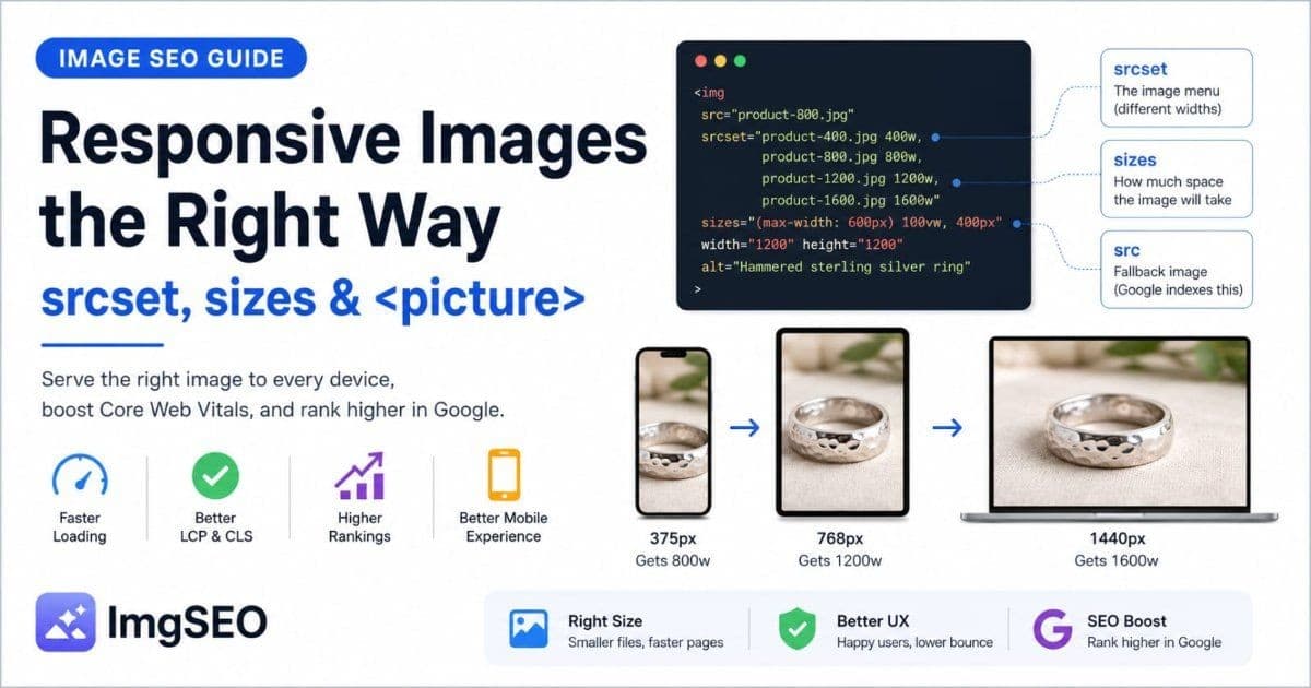
srcset and sizes are two attributes you add to an image tag. Together they let one image tag serve the right file to every screen. Here's a real example, then the walk-through.
<img
  src="product-800.jpg"
  srcset="product-400.jpg 400w,
          product-800.jpg 800w,
          product-1200.jpg 1200w,
          product-1600.jpg 1600w"
  sizes="(max-width: 600px) 100vw, 400px"
  width="1200"
  height="1200"
  alt="Hammered sterling silver ring on linen background"
>
Two attributes are doing the work:
srcsetis the menu. It lists four versions of the same photo with their real widths:product-400.jpgis 400 pixels wide (400w), and so on. Thewvalue is the file's actual width — not a screen size.sizesis the hint. It tells the browser how much space the image will occupy before the image loads. Here: on screens up to 600px wide, the image fills the full viewport (100vw); on anything larger, it occupies a fixed400pxcolumn.
Now the browser reasons it out. On a 375px phone, sizes says the image fills 100vw — so it needs roughly 375 pixels, doubled to 750 for a high-density screen. It scans the menu and picks product-800.jpg, the smallest file that still covers 750 pixels. On desktop, sizes says 400px, so it grabs the 400w or 800w file instead of the 1600w one.
That's the entire mechanism. The browser combines your sizes hint with the device's screen and pixel density, then chooses the smallest file that still looks sharp. Get sizes right and every device downloads only what it needs.
The src attribute is still there as a fallback. Older browsers that ignore srcset load it, and — importantly for SEO — it's the image Google indexes. More on that below.
The picture Element: When srcset Isn't Enough
The <picture> element is the heavier tool, and most product images don't need it. Reach for it in exactly two situations: art direction and format fallbacks. For everything else, srcset alone wins on simplicity.
Art direction means serving a different crop, not just a different size. On desktop you show a wide lifestyle shot of the product in a room; on mobile you crop tight to the product so it's still legible on a small screen. srcset can't do this — it only resizes one image. <picture> can:
<picture>
  <source media="(max-width: 600px)" srcset="ring-closeup.jpg">
  <source media="(min-width: 601px)" srcset="ring-lifestyle-wide.jpg">
  <img src="ring-lifestyle-wide.jpg" width="1200" height="800" alt="Hammered silver ring styled on a windowsill">
</picture>
Format fallbacks let you offer modern formats to browsers that support them, with a safe fallback for those that don't. The browser reads top to bottom and takes the first format it understands:
<picture>
  <source type="image/avif" srcset="product.avif">
  <source type="image/webp" srcset="product.webp">
  <img src="product.jpg" width="1200" height="1200" alt="Hammered sterling silver ring">
</picture>
That's AVIF for browsers that support it, WebP for the rest, and JPEG as the universal fallback. If you're weighing which formats to serve, our guides on WebP vs JPEG vs PNG and AVIF vs WebP cover the trade-offs.
One rule ties it together: whichever you use, the <img> inside <picture> is required, and its src is the fallback Google indexes. Never leave it out.
Density Descriptors (2x) vs Width Descriptors (400w)
srcset accepts two kinds of descriptors, and picking the wrong one costs you on product pages. For e-commerce, width descriptors (400w) are almost always the right choice.
Density descriptors look like product.jpg 1x, product-2x.jpg 2x. They tell the browser which file to use based only on screen pixel density — a 2x file for Retina displays, a 1x file for standard ones. The catch: they assume the image is always displayed at one fixed size. A logo that's always 200 pixels wide is a perfect fit.
Width descriptors look like product-400.jpg 400w, product-800.jpg 800w. They tell the browser each file's real width and let it choose based on both screen size and density, guided by your sizes attribute. This is what you want when the same image displays at different sizes on phone, tablet, and desktop — which describes every product photo.
Here's the rule of thumb:
| Descriptor | Use it for | Why |
|-----------|-----------|-----|
| Width (400w) | Product photos, hero images, anything that resizes across breakpoints | Adapts to both screen width and density |
| Density (2x) | Fixed-size assets: logos, icons, badges | Simpler, but only handles density |
Product images change size across your responsive layout. Width descriptors handle that; density descriptors don't. When in doubt on a store, use 400w-style width descriptors with a sizes attribute.
Aspect Ratio and CLS: Why width and height Are Non-Negotiable
Responsive images control which file loads. They do nothing for layout stability — that's a separate job, and skipping it wrecks a different Core Web Vital. Always set width and height, even on responsive images.
Here's the problem they solve. When an image has no dimensions, the browser doesn't know how tall it'll be until the file arrives. So it renders the page with no space reserved, then shoves everything down when the image loads. That jump is Cumulative Layout Shift (CLS), and Google measures it as part of Core Web Vitals.
Set width and height on the tag and the browser does the math up front. It reads the ratio — say 1200×1200, a perfect square — reserves a correctly shaped box immediately, and slots the image in when it loads. Nothing moves.
You still keep the image fluid with one line of CSS:
img {
  height: auto;
  max-width: 100%;
}
With width and height on the tag plus height: auto in CSS, the image scales to its container while the browser preserves the aspect ratio you declared. You get responsive and stable. Modern browsers use the width/height attributes purely to compute the ratio, so the numbers just need to match the image's real proportions.
How to Set It Up on Your Platform
You rarely hand-write srcset on a store platform. Each one generates it for you — your job is knowing how, and getting out of its way. This pairs closely with lazy loading, which decides when each of these responsive files loads.
Shopify
Shopify generates responsive images through the image_url filter with a width parameter. In Liquid, you request specific widths and Shopify's CDN produces each one on demand:
{{ product.featured_image | image_url: width: 400 }}
Modern themes wrap this in a responsive snippet that builds the full srcset for you — often via a shared image or responsive-image snippet that loops through a list of widths and adds sizes. Most Online Store 2.0 themes do this out of the box. Your job is to confirm the snippet is used on product and collection templates, and that sizes reflects your actual layout — not a copy-pasted default.
WooCommerce
WordPress adds srcset automatically. Since version 4.4, wp_calculate_image_srcset() builds a srcset from the intermediate image sizes WordPress generates on upload, and outputs it on your product images without any plugin.
The complication is CDNs. If you run an image CDN or optimization plugin that rewrites image URLs, it can clash with WordPress's built-in srcset — you end up with two systems fighting over the same tag, sometimes producing broken or duplicated variants. When that happens, the fix is to let one system own it. Either configure the CDN to respect WordPress's srcset, or disable the native srcset with a filter on wp_calculate_image_srcset and let the CDN generate everything. Pick one source of truth.
Custom Next.js
On Next.js, the next/image component generates srcset and sizes for you. The one attribute you must set by hand is sizes, because Next.js can't know your layout:
<Image
  src="/products/hammered-silver-ring.jpg"
  alt="Hammered sterling silver ring"
  width={1200}
  height={1200}
  sizes="(max-width: 600px) 100vw, 400px"
/>
Without a sizes prop, next/image assumes 100vw and generates a srcset skewed toward large files — the exact over-serving you're trying to avoid. You can also tune the widths Next.js generates through the deviceSizes and imageSizes arrays in next.config.js, so the breakpoints match your design instead of the defaults.
Image CDN Pairing: One Master File, Every Size On Demand
The reason none of this means exporting six copies of every photo: image CDNs generate the variants for you. Cloudinary, Imgix, and the Shopify CDN all create resized versions on the fly from a single master image, then cache them.
The pattern is a URL parameter. You store one high-resolution master, and each size is just a different URL — ?w=400, ?w=800, and so on. The CDN reads the parameter, produces that size the first time it's requested, caches it, and serves the cached copy to everyone after. Your srcset becomes a list of the same URL with different width parameters.
This solves the storage and workflow problem that stops people from adopting responsive images at all. You don't batch-export, you don't manage six files per product, and you don't re-export when you change breakpoints. Many CDNs also handle format negotiation — serving AVIF or WebP automatically based on what the browser accepts — which does the <picture> format-fallback job for you at the URL level.
For a store, the practical setup is: upload one large, high-quality master per product, let the platform or CDN generate the sizes, and make sure the resulting URLs aren't blocked from Google.
Common Responsive Image Mistakes
When responsive images underperform, it's usually one of these five. Each is quick to check.
1. Same-size images at every breakpoint. A srcset that lists product.jpg 1200w and nothing smaller isn't responsive — it's one big file with extra syntax. Include genuinely smaller widths (400w, 800w) so phones have something small to pick.
2. Missing sizes attribute. Leave off sizes and the browser assumes the image fills the whole viewport (100vw), so it picks a file sized for a full-width image even when yours sits in a narrow column. Always set sizes to match the image's real display width.
3. Serving PNG when WebP would do. Responsive sizing saves bytes; the wrong format wastes them again. A photographic product shot as PNG is often far heavier than the same image as WebP or AVIF. Match the format to the content — see WebP vs JPEG vs PNG.
4. Blocking srcset variants from Google. If your resized variants live on a CDN host that robots.txt blocks, Googlebot can't fetch the images. Since Google relies on the crawlable src and can also read srcset, make sure every image host allows crawling. An image sitemap helps Google discover the canonical image URLs too.
5. No width and height. Covered above — without them, responsive images still cause layout shift. Non-negotiable on every image tag.
How to Verify It's Working
Don't trust the markup — watch the browser choose. Three tools confirm responsive images are actually saving bytes.
Chrome DevTools and currentSrc. Open DevTools, select an image in the Elements panel, and check its currentSrc property in the console (or the Properties tab). currentSrc shows the file the browser actually chose from your srcset — not what you listed, but what it picked. Resize the window or toggle device emulation and watch currentSrc change to a smaller file on narrow screens. That's proof the mechanism works.
Lighthouse "Properly size images." Run Lighthouse (in DevTools or PageSpeed Insights) and find the "Properly size images" audit. It lists every image bigger than it needs to be, with the potential byte savings. After adding responsive images, this list should shrink or clear. It's the single best scorecard for this work.
WebPageTest filmstrip. For a real-device view, run the page through WebPageTest on a mobile profile and check the filmstrip and waterfall. You'll see exactly which image files loaded and how big they were on a phone-shaped screen — confirming the small variants are the ones being served in the field.
Run these while setting up, then re-check after theme or plugin updates. Responsive images can quietly regress when a platform change resets your sizes or srcset. The same rhythm applies across the whole image speed and SEO stack.
Your Responsive Images Checklist
Run any product page through this before moving on:
- [ ] Product images use
srcsetwith genuinely different widths (not one size) - [ ] Width descriptors (
400w) used for product photos, not density (2x) - [ ] Every responsive image has a
sizesattribute matching its real display width - [ ]
srcpoints at a good full-size file — that's the one Google indexes - [ ]
<picture>used only for art direction or format fallbacks, with a fallback<img> - [ ] Every image has explicit
widthandheight(plusheight: autoin CSS) - [ ] Image variants aren't blocked by
robots.txton any host or CDN - [ ] DevTools
currentSrcshows a smaller file loading on mobile widths - [ ] Lighthouse "Properly size images" is clear or near-clear
Frequently Asked Questions
Does srcset help SEO?
Indirectly but meaningfully. srcset doesn't rank an image by itself, but it lets phones download a phone-sized file instead of a desktop-sized one. That improves mobile page speed and Largest Contentful Paint — both ranking signals. It also improves the experience Google measures through Core Web Vitals. So it helps SEO the same way any real speed win does.
Which image size does Google index?
Google indexes the image in the src attribute — the single fallback URL, not the srcset variants. Googlebot can crawl srcset images, but Google's guidance says it isn't always reliable, so the src is the guaranteed one (Google Search Central). Always point src at a good, full-size version of the image you want ranking in Google Images.
Do I need the picture element or is srcset enough?
For most product images, srcset plus sizes is enough — it handles serving different sizes of the same photo. Reach for <picture> only when you need art direction (a different crop on mobile vs desktop) or format fallbacks (AVIF, then WebP, then JPEG). If you're just resizing one image, skip <picture>.
Does responsive images fix Cumulative Layout Shift?
Not on its own. Responsive images control which file loads; width and height attributes control layout stability. You need both. Always set explicit width and height (or an aspect-ratio) on responsive images so the browser reserves the space before the file arrives — otherwise the page jumps and your CLS score suffers.
Will responsive images slow down my server or storage?
Not if you use an image CDN. Cloudinary, Imgix, and the Shopify CDN generate each size on the fly from one master file, so you store one image, not six. You reference the sizes you want in the URL, and the CDN creates and caches them. No batch exporting, no extra storage to manage.
The Bottom Line
Responsive images fix the single biggest mobile speed leak in e-commerce: phones downloading desktop-sized photos. Give the browser a srcset menu with real widths, a sizes hint that matches your layout, and width and height for stability. Point src at a solid full-size file so Google indexes the right image, and let a CDN generate the variants so you're not managing six copies of everything.
Serving the right-sized file is half the battle. The other half is making sure each of those images carries the alt text, filename, and metadata that lets it rank once Google fetches it. That's what ImgSEO automates — AI-generated alt text, keyword-rich filenames, and embedded SEO metadata for your product images, in batches. You can try it free on 30 images, no credit card required.
Size the file to the screen. Point Google at the fallback. Optimize every pixel it indexes. That's responsive images done right.